Tool Is Certified by Microsoft:

For more information visit our Microsoft app source link https://appsource.microsoft.com/en-us/product/power-bi-visuals/officesolution1640276900203.bar-chart-run-time-convertible-in-scatter-plot?tab=Overview
Office Solution Capacity Monitoring tool enables organizations to track Centrally:-
The polar scatter plot is a type of chart that displays data points in
Cohort Chart
Calendar Chart
POWER BI LOAD TESTING SOLUTION
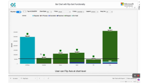
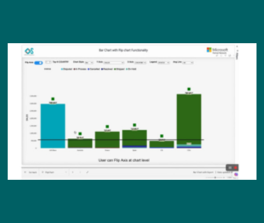
Empower users with dynamic bar charts, allowing real-time numeric aggr
The Fishbone Chart, also known as an Ishikawa or cause-and-effect diag