Product Detail

Bar Chart with Dynamic Range creation

Tool Is Certified by Microsoft:

Problem Statement

Organizations often require flexible and dynamic data visualization tools to accurately analyze and interpret their data. Standard bar charts may lack the adaptability needed for detailed and nuanced analysis. Key challenges include:

  1. Fixed Aggregation Buckets:

    • Users may be constrained by predefined buckets for data aggregation, limiting their ability to customize the analysis based on specific needs or insights.
  2. Limited Comparison Capabilities:

    • Comparing different KPIs (Key Performance Indicators) within a single chart can be challenging, particularly if the chart does not support dynamic adjustments or additional indicators.
  3. Inflexible Dimension and Measure Management:

    • Users often face difficulties in dynamically changing dimensions, measures, or legends at runtime, impacting their ability to perform in-depth analysis or adjust to changing data needs.
  4. Static Top N Analysis:

    • Standard charts may not easily allow users to focus on the top N areas, which can hinder the analysis of key data segments.
  5. Lack of Visual KPI Indicators:

    • The absence of visual indicators, such as icons with conditional formatting, can make it harder to quickly assess the performance of key KPIs.

The Bar Chart with Dynamic Range Creation by Office Solution addresses these challenges with the following features:

  1. Dynamic Numeric Aggregation Buckets:

    • Users can create and customize numeric aggregation buckets in real time, allowing for flexible data analysis and tailored insights.
  2. Average Line Integration:

    • Users can draw an additional average line at each individual bar level or for the overall chart, facilitating a clearer understanding of data trends and performance.
  3. KPI Comparison:

    • The chart enables users to compare individual KPIs to see if they are improving or declining relative to another KPI, enhancing comparative analysis.
  4. Dynamic X Axis Management:

    • Users can dynamically change X Axis dimensions or measures at runtime, allowing for flexible analysis and adaptation to evolving data needs.
  5. Dynamic Y Axis Management:

    • Business users can also adjust Y Axis dimensions or measures dynamically, improving their ability to perform detailed analysis.
  6. Dynamic X Legends:

    • Users can modify X Axis legends at runtime, providing greater control over how data is represented and analyzed.
  7. Top N Focus:

    • The chart allows users to focus on the top 5 or top 10 areas, helping to highlight key segments of the data.
  8. Visual KPI Indicators:

    • Users can display additional KPIs in the form of icons at the end of each bar, with conditional formatting applied. This feature helps in quickly assessing whether key KPIs are performing well or not.
Conclusion

The Bar Chart with Dynamic Range Creation by Office Solution provides a versatile and powerful tool for data analysis. By enabling dynamic aggregation, comparison, and customization, the chart enhances users' ability to gain insights and make informed decisions. Its features support flexible data management, real-time adjustments, and effective KPI monitoring, addressing common challenges and improving overall data analysis capabilities.

Key features:

1. Users can create numeric aggregations buckets as per their req at run time

2. Users can draw an additional Average line at each individual bar level or overall chart level

3. Users can compare individual KPI is going up or down in respect to another KPI

4. Business users can change X Axis dimensions/Measure dynamically at run time

5. Business users can change Y Axis dimensions/Measure dynamically at run time

6. Business users can change X Legends dynamically at run time

7. Business users can focus only top 5 or top 10 areas

8. Users can use an additional KPI which can be draw in the form of Icons at the last of bar with conditional formatting applied , it helps in assessing if our key KPI indicators are doing well or not. 

Other products

Office Solution Capacity Monitoring tool enables organizations to track Centrally:-
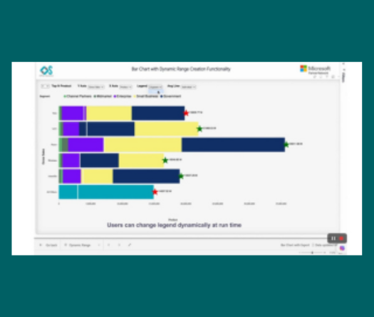
Fishbone chart

The Fishbone Chart, also known as an Ishikawa or cause-and-effect diag

Cohort Chart

Cohort Chart

Circular Dendogram

The Circular Dendrogram Chart offers a unique and vis

Line With Bubble Chart


Connected Scatter Plot chart

Connected Scatter Plot chart

Bar Chart with Dynamic Range creation

Empower users with dynamic bar charts, allowing real-time numeric aggr

Hanging Rootogram Chart

The Hanging Rootogram chart is an advanced statistical visualization t

MultiKPIGrid

A profit and loss statement summariz