Product Detail

Spiral Plot Chart

Tool Is Certified by Microsoft:

Problem Statement

Challenges in Visualizing Time-Series and Cyclical Data:

Organizations often face difficulties in effectively visualizing time-series data or identifying cyclical patterns using traditional charts. These challenges can lead to:

  1. Difficulty Tracking Trends Over Time:

    • Time-series data with complex patterns may not be clearly represented in standard linear charts, making it hard to identify trends, peaks, and troughs.
  2. Limited Space Utilization:

    • Traditional charts may not efficiently handle large datasets, leading to cluttered visuals and difficulty in interpreting the data.
  3. Lack of Interactivity:

    • Many charts lack interactive features, limiting the depth of analysis and user engagement with the data.
  4. Challenges in Highlighting Key Data Points:

    • Identifying and focusing on critical data points can be challenging with conventional visualization methods.

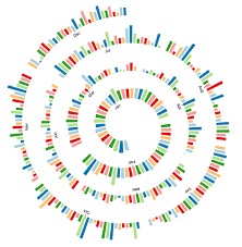
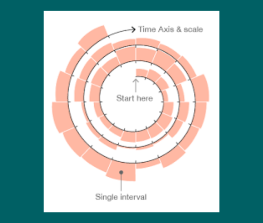
The Spiral Plot by Office Solution addresses these challenges by offering a specialized chart designed to visualize data in a spiral format. This unique layout emphasizes trends and cyclical patterns, providing enhanced clarity and interactivity. Key features include:

  • Visual Clarity: The spiral design clearly displays trends, peaks, and troughs over time, enhancing readability.
  • Compact Layout: Efficiently utilizes space, making it suitable for large datasets without clutter.
  • Dynamic Data Handling: Manages extensive datasets smoothly with quick rendering.
  • Color-Coded Data Points: Customizable colors help differentiate data based on specific criteria.
Conclusion

Conclusion The Spiral Plot offers a versatile tool for diverse industries, providing both basic and premium features to suit different data visualization needs. Whether for project management, sales analysis, healthcare monitoring, or economic forecasting, its engaging visual format and interactive capabilities facilitate deeper insights and effective decision-making.

Key Benefits

Basic Features:

Visual Clarity: The spiral design enhances readability by clearly displaying trends, peaks, and troughs over time. Compact Layout: Efficiently utilizes space, making it suitable for large datasets without clutter.

Dynamic Data Handling: Handles extensive datasets smoothly with quick rendering.

Color-Coded Data Points: Customizable colors help differentiate data based on specific criteria.

Premium Features:

Customizable Dimensions: Adjust chart dimensions for various screen sizes and layouts.

Interactive Elements: Tooltips provide detailed insights when hovering over data points, enhancing user interaction. Point of Cross-Selection: Clicking on data points highlights related information, facilitating deeper analysis.

Logo Removal: Premium version allows branding removal for seamless corporate integration.

Top N Selection: Focus on critical data points by selecting or typing through a dropdown menu.

Real and Practical Use Cases

Project Management: Milestone Tracking: Visualize project phases and identify delays or overlaps.

Task Progress: Monitor task completion over time.

Sales and Marketing: Campaign Performance: Analyze marketing campaign engagement and sales spikes.

Customer Behavior: Track customer engagement patterns for targeted marketing strategies.

Healthcare and Medical Research: Patient Monitoring: Monitor treatment outcomes and symptom progression.

Epidemiological Studies: Visualize disease spread and effectiveness of containment measures.

Finance and Economics: Market Trends: Track stock prices and market cycles for investment strategies.

Economic Indicators: Visualize GDP, inflation, or unemployment rates for economic forecasting.

Other products

Office Solution Capacity Monitoring tool enables organizations to track Centrally:-

Power BI Premium Capacity

Power BI Premium Capacity Analytics Solution Reduce your Power BI prem

Stacker Bar Chart With Top N

Select Top N number of items to be displayed in chart and rest items w

Cohort Chart

Cohort Chart

HR_Analytics

Lorenz Curve Chart

Lorenz Curve by Office Solution

T

Magic Grid Advanced Analytics ChatGPT Solution

Magic Grid Advanced Analytics ChatGPT Solution

Magic Grid PBI Report Burst Solution

The Magic Grid PBI Report Burst Solution is a Power B

Barley Trellis chart

The Barley Trellis chart, inspired by Becker et al.'s groundbreaki